Just recently, I decided to sign up for Google’s UX Design Professional Certificate.

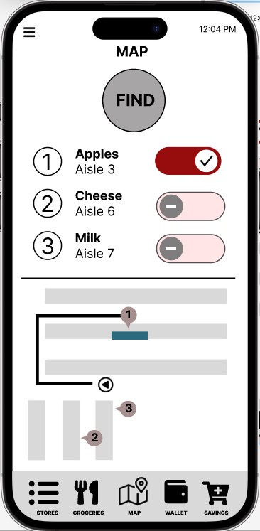
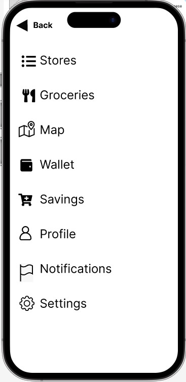
So far I have learned how to use Figma (a tool that allows you to create, share, and test designs for website, mobile apps, and other digital products), and designed my first food app that would allow shoppers to locate products for a local grocery store as they shop in person.
Now why did I choose to design this kind of an app? Let me provide some context.
Throughout the first two lessons of this course, you are asked to come up with a concept for designing an app to use in your portfolio. Being that I use a walker and sometimes choose to go to the supermarket to get my groceries, I wanted to create something that would allow me to:
- Choose a store that I frequent,
- Have a running list of items I shop for,
- Provide real time inventory information,
- Find groceries quickly with no backtracking,
- Have multiple ways to pay, and
- Show savings based on my items.
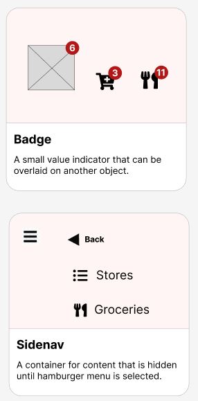
Here is a quick view of my work so far.
Wireframe
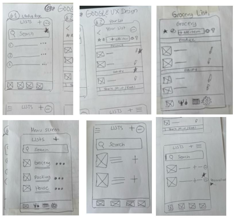
Mockup
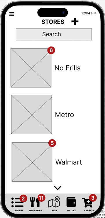
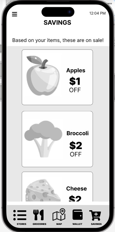
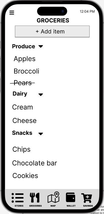
Key Features for a Grocery App
Here are my design ideas for product enhancement. Not all ideas have been implemented, but I wanted to show you my thinking process – take a look!
Core Functionality:
- Product Locator: Real-time in-store product location based on GPS or store map.
- Shopping List Integration: Seamlessly syncs with existing shopping lists or allows for quick creation.
- Barcode Scanner: Efficiently add items to cart by scanning product barcodes.
- Mobile Payments: Contactless payment options for faster checkout.
Value-Added Features:
- Recipe Integration: Offers quick and easy recipes based on available ingredients.
- Nutrition Information: Provides clear and concise nutritional data for products.
- Meal Planning Tools: Helps users plan meals and create shopping lists accordingly.
- In-Store Deals and Coupons: Offers personalized deals based on shopping history and preferences.
- Express Checkout Lane: Prioritizes users with the app for faster checkout.
Design Considerations:
- Minimalist Interface: Clear and uncluttered design for quick navigation.
- Large, Tap Buttons: Easy to use with one hand while shopping.
- Voice Commands: Option to add items to cart or search for products using voice.
- Offline Functionality: Allows app to work without internet connection for in-store use.
Potential Design Ideas:
- Interactive Store Map: A map that highlights product locations and can be filtered by category.
- Scan and Go: Allows users to scan items as they shop and pay directly through the app.
- Quick Meal Suggestions: Offers recipe ideas based on items in the cart or nearby aisles.
Persona
“As a person with a mobility challenge, when I go to the grocery store, I don’t want to spend hours finding food. My main grievances are spending two hours locating the correct food aisle, finding out the item I wish to purchase isn’t available, or backtracking through the whole store because I forgot something!”
Name: Tanya
Age: 50
Occupation: Higher Education Faculty
Lifestyle: Values convenience, health, and time efficiency. Often relies on meal planning but struggles to stick to the list due to impulse buys.
Goals: Quick and efficient grocery shopping, healthy meal options, avoiding overspending.
Frustrations: Long checkout lines, difficulty finding specific items, unhealthy impulse buys, lack of inspiration for quick meals.


Pingback: Welcome to the Friendly Professor — a practical guide to learning, teaching, and designing better experiences. - Friendly Professor